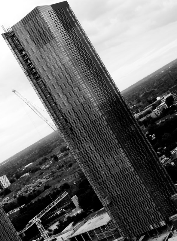
DIAGONALS
|
There is two diagonal lines in this image. The most obvious diagonal being the building which stretches from one corner of the image to the another. This enforces it as the subject of the image as it makes it take up more space than it would if it was straight. There is also the diagonal of the horizon. This also helps draw attention to the building as it appears to be almost slicing the building in half.
|
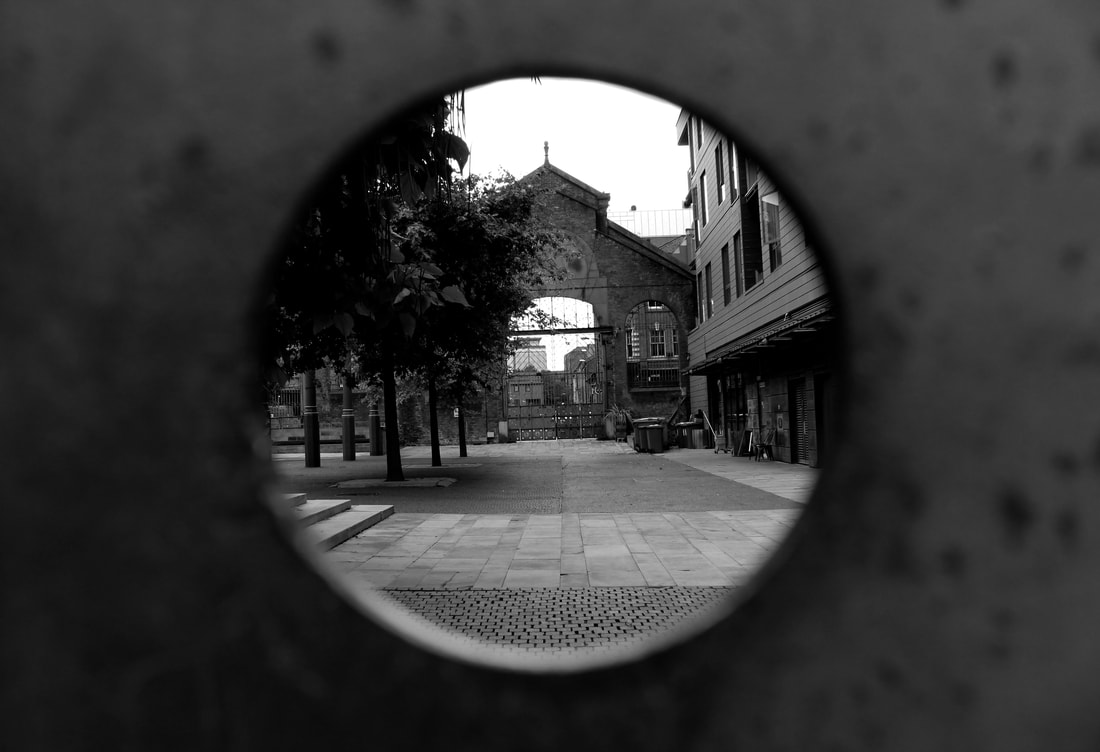
FRAMING
|
The use of a gate as a frame, and the circular shape, makes it feel like you are looking into a secret or exclusive area. The rust that can be seen in the forefront ages the image. With the brick wall, gate and trees making it appear like a magical or secret garden but the building on the other side drags the image up to date
|
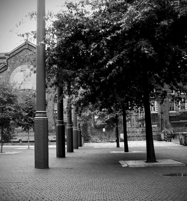
LEADING LINES
|
The leading lines in the image don't lead to a subject they are the subject of the image themselves. They create a path between them that wasn't there before. The top left corner of the image is slightly over exposed making the leaves of the tree hard to see the image would be improved by making it all evenly exposed.
|
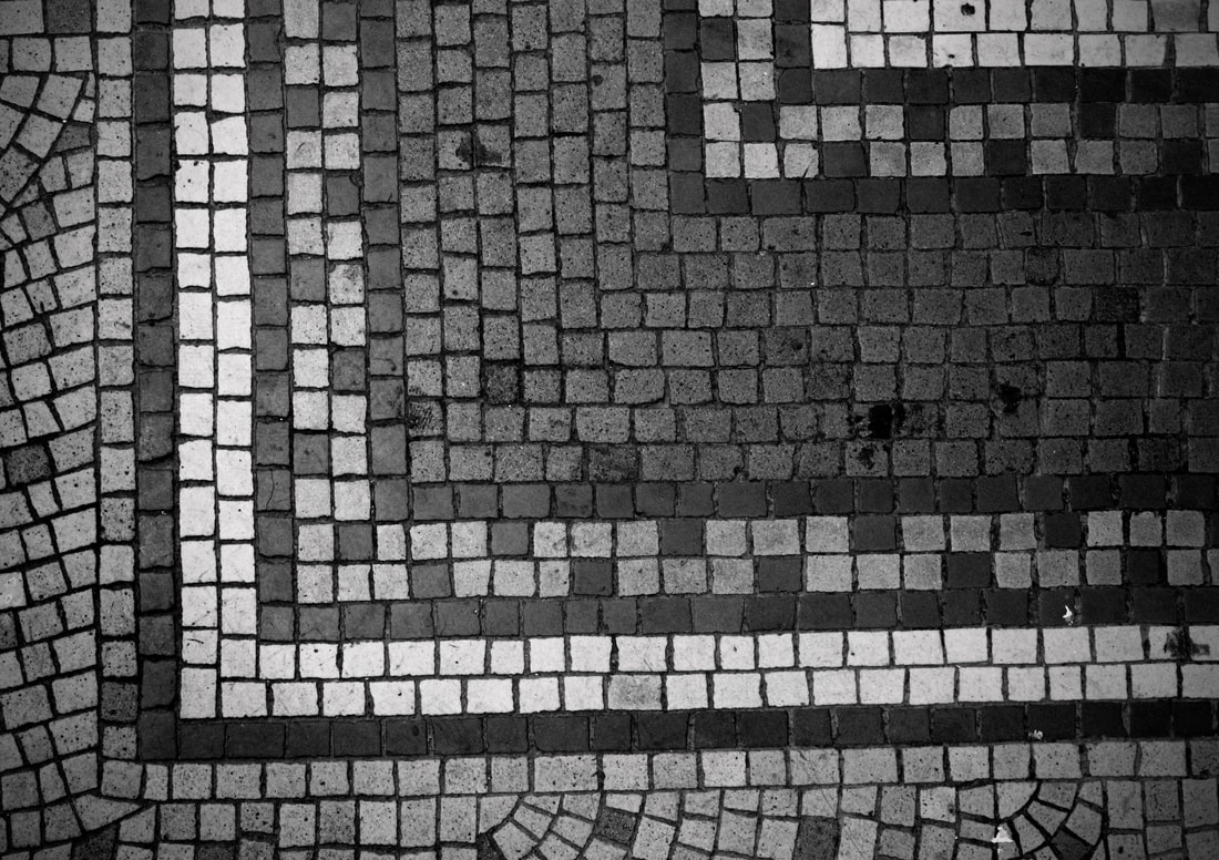
PATTERN
|
Although this pattern consists of all straight lines, the different sized tiles creates a messy effect. This photo could be improved by being taken straight from above, as you can see from the dark line across the bottom being on a slight upwards gradient, that it was taken at a slight angle. Also the top right corner looks darker than the rest of the image. It would be more uniform if it was all exposed to the same light.
|
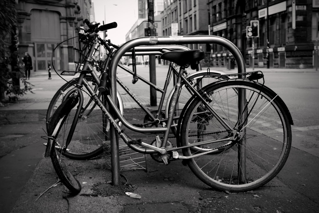
POINT OF INTEREST
|
The blurred background around the front bike makes it obvious that the front bike is the subject. However you don't at first notice that the wheel on the bike it bent and at an odd angle, which is why the bike is an interesting subject. This could be made more prominent by being taken at a different angle that better showcased the damaged wheel.
|
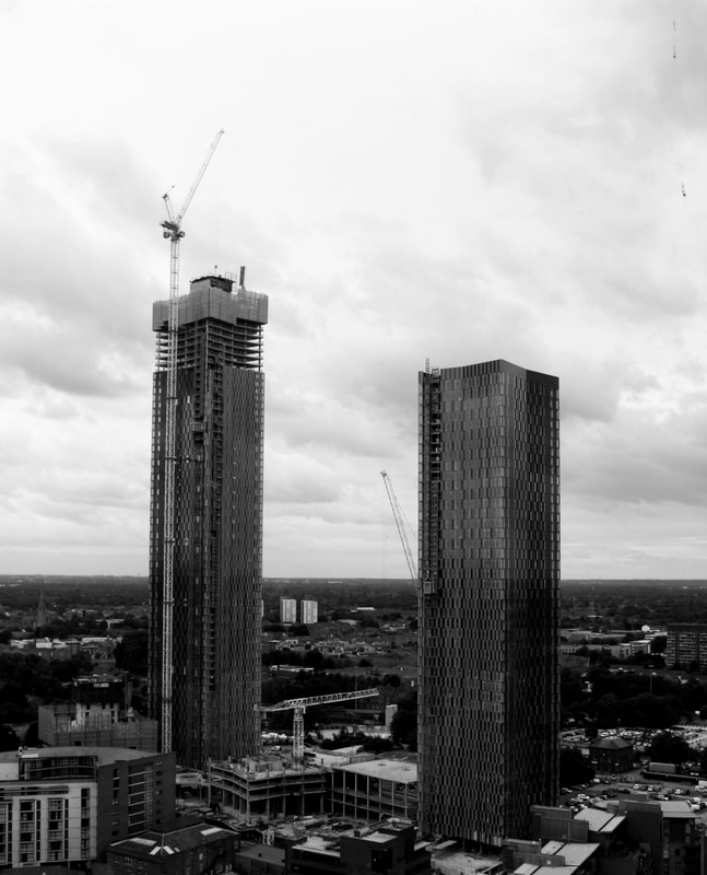
RULE OF THIRDS
|
Both buildings in this image lay on thirds. By doing this they are evenly spaced as they are the same distance from the edge of the image on either side. The horizon is placed on the lower. The white sky highlights the buildings so they don't get lost in the mass of other grey buildings below, highlighting them as the subject of the image.
|
SYMMETRY
|
Although the buildings are not completely identical the positioning for the most part is the same. They both also feature an open section for construction that looks similar but in different places and the pattern created by the windows is mirrored in both buildings. It could be suggested that this represents how in the modern world everything is mass produced and looks the same even on such a large scale. The angle the image was taken at has caused the second building to be at a slight angle and left building takes up a little more space. Changing these would make the buildings appear more symmetrical. Also the horizon would look better on a lower third as the white background would highlight the buildings more making them more obvious as the subject of the image.
|
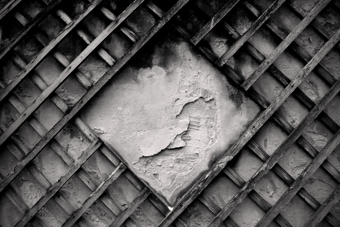
TEXTURE
|
The wood is old and damp, and you can see the worn texture a lot at the top of the image where mould covered the wood. The diamond shaped gap in the middle also emphasizes the rough texture of the wall by framing a large section that appears to be poorly made or crumbles.
|
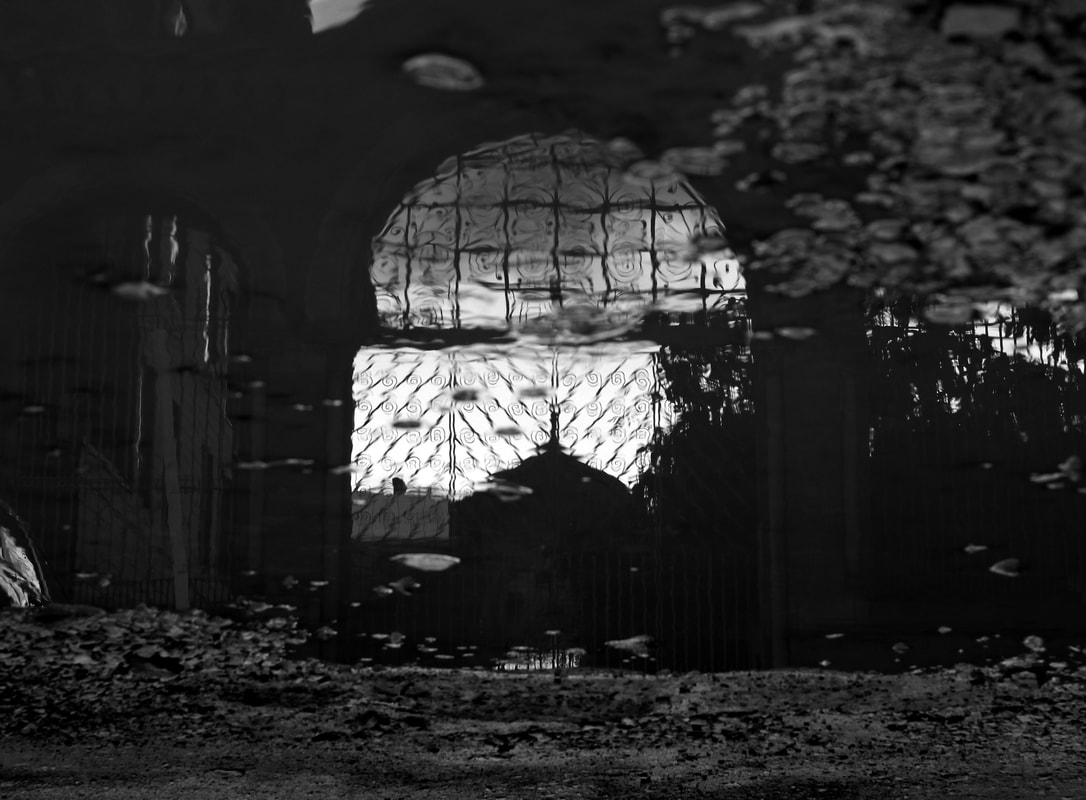
VIEWPOINT
|
The middle gate can be seen in quite a lot of detail as it has the white sky behind it. You can even make out the swirly pattern in the bars. The wall and other gates however, cannot be distinguished very well from the floor and puddle below as they are both dark shades. Having the middle gate most visible makes it appear grander. It also doesn't overload the image with different subjects. It appears as though the gate is another world that can only be seen through the puddle.
|
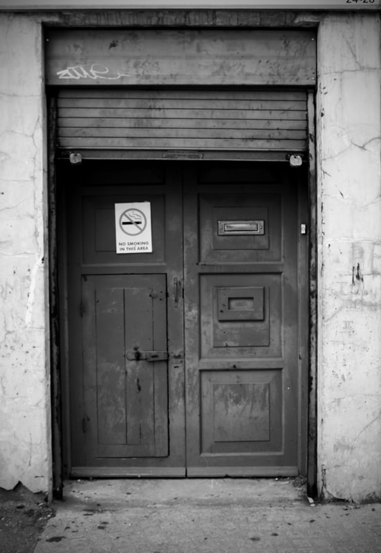
CONTRAST
|
The contrast in this image highlights the disrepair of the door, shutter and even the wall itself. The contrast makes the dirt on the door more noticeable. Along with the graffiti and rust on the shutter, and cracked and crumbling plaster on the wall. The shades although are not too drastically different and the grey of the door could be darker to create more of a distinction between the shutter and the door. Also the door isn't well focused, having better focus would improved the image.
|
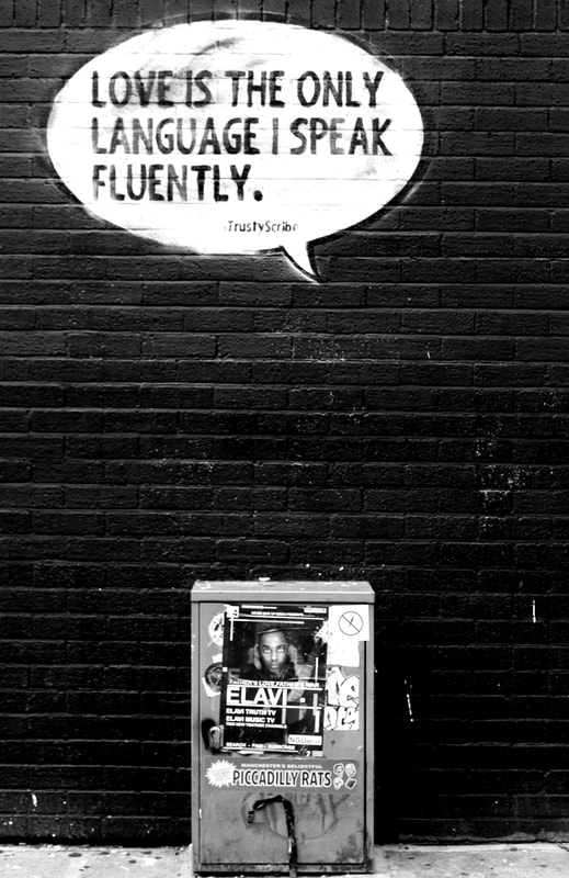
SIMPLICITY
|
The way the speech bubble is placed slightly left of the electricle box makes it appear as though the person in the poster on the box is saying it. Some aspects of the photo have been washed out and so cannot be seen properly, like the smaller writing at the bottom of the speech bubble or the no smoking sign on the top right corner of the electricle box. The image would look better if everything was properly focused and evenly exposed.
|
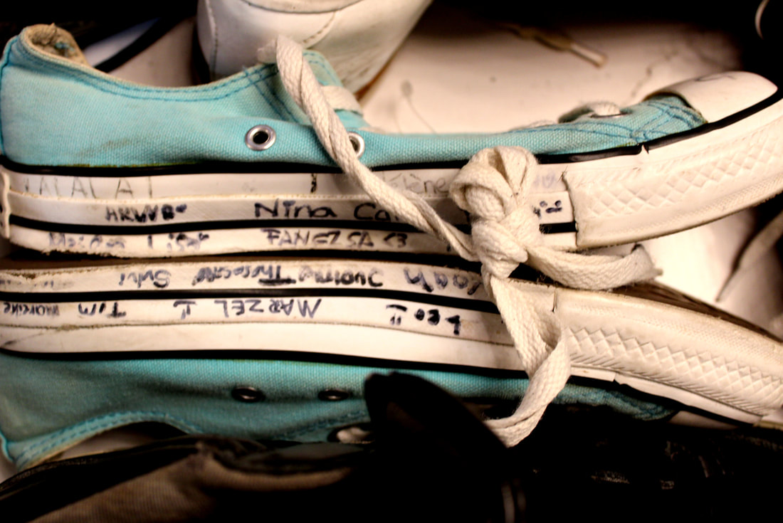
BOLD COLOUR
|
The other shoes surrounded the blue ones are black and white making the blue the only colour in the photo so it stands out more. However the black shoe at the bottom is obstructing the view of the lower blue shoe and it would look better if it was moved out of the way more. Also the main focus of the image is the writing on the edge of the bottom of the blue shoes. Some of the writing cannot be seen very well though. This may be through poor focus of the image or just deuteriation of the marker on the shoe due to age.
|
